NetDiligence sets the standard for cyber insurance, yet their digital presence was stuck in the analog age. While nimble InsurTech competitors disrupted the market with cinematic visuals, NetDiligence risked blending in as a static service provider. Kubikware engineered a total brand evolution. We shifted their identity from "legacy vendor" to "industry visionary." By leveraging a bold, dark-mode aesthetic and a cohesive narrative strategy, we built a digital experience that does more than inform the C-Suite: it commands their attention.
Challenge
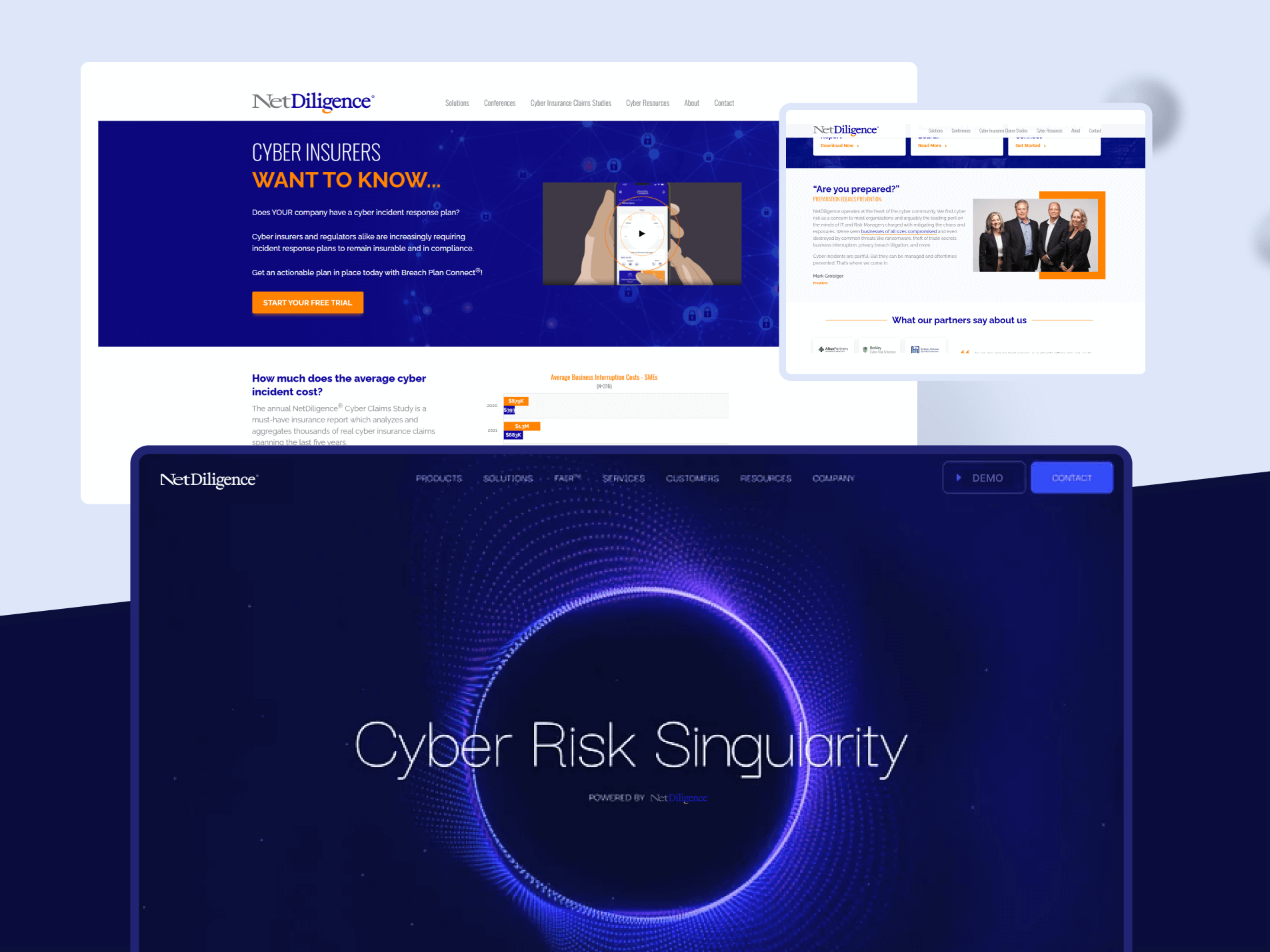
Global authority, invisible urgency. NetDiligence held the market expertise, but their website lacked the market pulse. The previous site was structurally rigid and visually safe, failing to convey the high-stakes velocity of modern cyber threats. It suffered from a "one-message-fits-all" problem: insurers, brokers, and enterprise leaders were all greeted by the same generic, text-heavy content. The site failed to guide these distinct personas to their specific solutions. In a landscape dominated by "Active Insurance" competitors with slick, high-tech positioning, NetDiligence risked looking like a legacy utility rather than a technology leader.
Goal
Turning a service list into a cinematic story. Our objective was to synchronize the brand’s visual identity with its technical prowess. We needed to dismantle the "brochure" mentality and build a conversion-driven storytelling engine. The goal was to create an immersive digital environment that felt less like an insurance policy and more like a security operations center. We aimed to segment the user journey immediately, ensuring that whether a user was a frantic CEO facing a breach or a methodical underwriter seeking data, the site spoke directly to their pain points with clarity, authority, and modern sophistication.
Solution
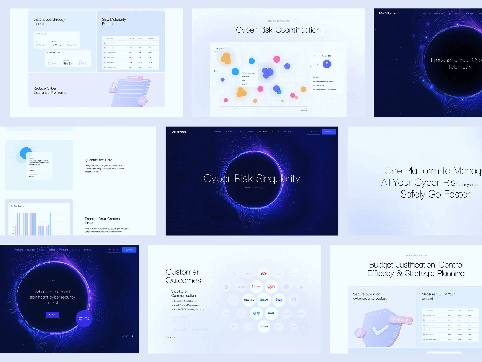
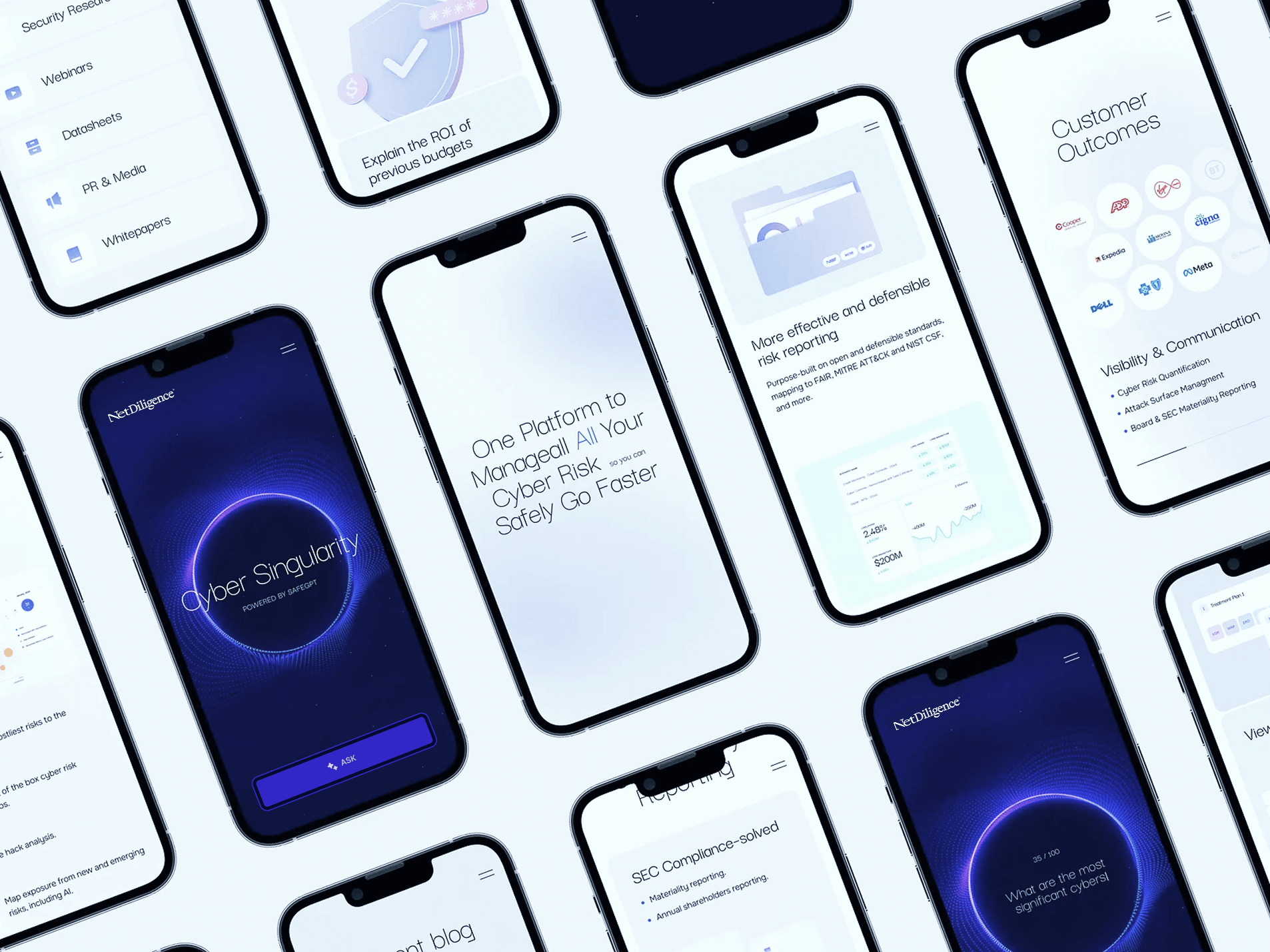
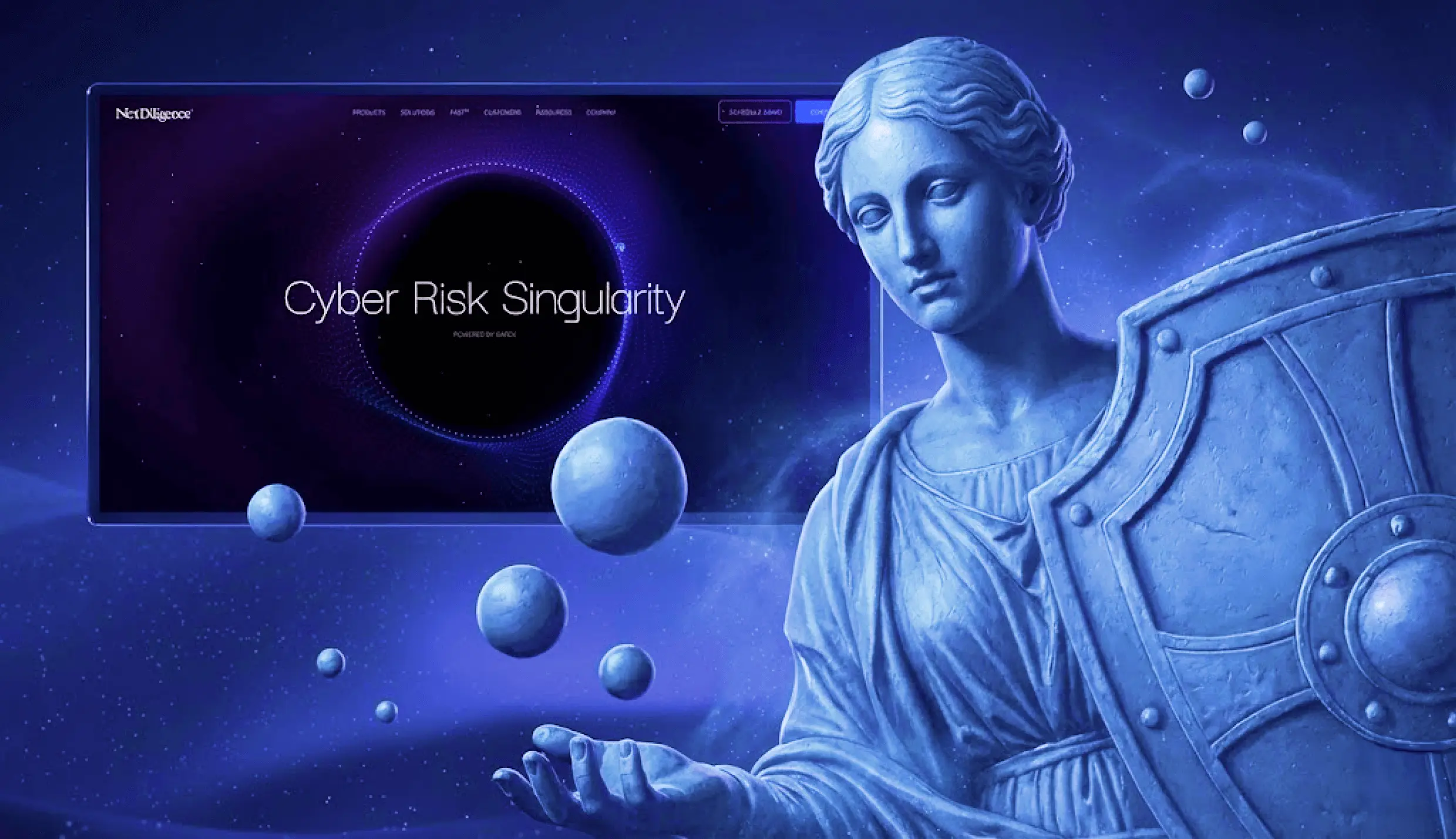
The "Singularity" identity: Visualizing the invisible. We completely reimagined the NetDiligence brand universe through the concept of the "Cyber Risk Singularity." We shifted the palette from traditional corporate white to a deep, premium dark mode, punctuated by vibrant data streams and the central "Singularity" orb, a visual metaphor for NetDiligence being the center of the InsurSec gravity (and a key piece of their previous brand look & feel).
We restructured the information architecture to prioritize "scrollytelling," where users are guided through the ecosystem; from "Breach Plan Connect" to "Cyber Claims Studies", through fluid animations and direct, problem-solving headlines. We also optimized the mobile experience and integrated dynamic content blocks. We turned the website into a living entity that validates NetDiligence’s leadership before the user even reads a single case study.
OUR WORK